While working with word-processors (I prefer to work
with
LibreOffice)
I've learned to appreciate working with style-sheets and profiles.
That's why I decided to build this site upon style-sheets.
Googling on key words 'modern html5 css' led me to
Create
modern Web sites using HTML5 and CSS3. The first layout, used for my
first home-page, is greatly based on this article.
My
first home-page looked like this:
The
most interesting part in the style-sheet was on the navigation bar.
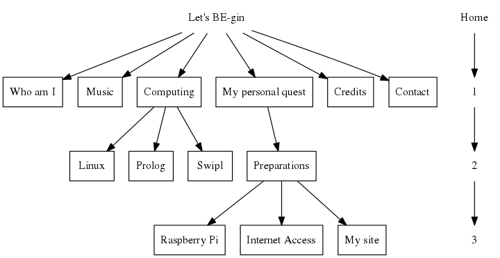
My present site-map is as follows:
My aim was to
adapt the nav-bar in such a way that it would follow this convention:
- The last chosen nav-item (i.e 'My site') is showen in the
'topframe'.
- All the menu-items that were needed to reach a page are
shown first.
The 'prev'-tag is used to give all these items
another color
- All the child menu-items on the same or the next following
level are displayed last.
I only needed to add one rule ("nav ul li a prev") and one new
<prev>-tag to the style-sheet.
nav ul {
list-style: none; padding: 4px; display: block;
clear: right; background-color: #666;
padding-left: 4px; height: 24px;
}
nav ul li {
display: inline; padding: 0px 24px 5px 10px;
height: 24px; border-right: 1px solid #ccc;
}
nav ul li a prev {
color: yellow; text-decoration: none;
font-size: 13px; font-weight: bold;
}
nav ul li a {
color: #EFD3D3; text-decoration: none;
font-size: 13px; font-weight: bold;
}
nav ul li a:hover{
color: #fff;
}
nav ul li a prev:hover{
color: #fff;
}

Layout 1 is very traditional, boring. Layout is my first step towards
a more modern site.
I can remember that working
with frames always used to give me headaches. And I also remembered
that frames could be replaced by div's.
It took me 2 days to
implement a css-style that simulated 1 top-frame and 2 columns. I
played a lot with the z-index and the overflow properties but no
matter what I did, it didn't work as intendet.
I learned a
lot while working on this problem but it was very frustrating to see
that all the problems were caused by 1 typo.
I have
implemented the div's like this:
#topFrame { position: fixed;
display: block;
top: 0; left: 0;
width: 100%; height: 100px;
padding-top: 15px;
overflow: hidden; z-index: 25;
background: #ffffff; }
#sideFrame { position: fixed;
display: block;
top: 0; left: 0;
width: 125px; height: 100%;
margin-top: 100px;
overflow: hidden; z-index: 20;
padding: 0px 5px 5px 5px;
background: #F4FFD9; }
#contentFrame {
display: block;
margin: 100px 0 0 120px;
padding: 20px 0 10px 20px;
overflow: auto; z-index: 25;
background: #F4FFD9; }
So now my site is working and I can switch to
configuring
ODBC
At work I use a 21"-screen. "Looking at
My
Site, I saw that the big graph looked awfull. All the lines were
displayed as dahed lines. Maybe that in the future I will start
working on the lines itself but for the moment, I just want to make
the contentFrame more narrow.
Adding a new div for
a column at the right side of the screen was very easy. The new
stylesheet is now as follows:
#sideFrame, #sideFrameRight { position: fixed;
display: block;
top: 0; left: 0;
width: 125px; height: 100%;
margin-top: 100px;
overflow: hidden; z-index: 20;
padding: 0px 5px 5px 5px;
background: #F4FFD9; }
#sideFrameRight {
left: auto; right: 0;
}
And after adding the line:
<div id="sideFrameRight"></div>
I had added the column.